14 years as a designer. The last few in fintech. I got tired of faking chart data in mockups and built something to fix it.
I've been a designer for 14 years. Software, iGaming, branding work across industries. The last two or three of those years landed me in fintech - trading platforms, investment products, the kind of work where the data on screen actually means something to the people looking at it. And from the first week designing for a trading audience, I ran into the same problem every fintech designer eventually hits. You need a realistic chart for your mockup. Your options are bad.
You can fake the data - invent numbers that look plausible and hope nobody notices Bitcoin climbing from $80K to $120K in a suspiciously smooth line with zero volatility. Or you take screenshots from actual trading platforms, spend twenty minutes cropping and masking, and hope you never need to change the timeframe. Or you export real data from somewhere, feed it into a charting library, screenshot that, drag it into Figma, and by the time you're done the design review started without you.
I complained about this for a while. Assumed someone would fix it eventually. Nobody did. So I built a Figma plugin for real stock market data myself.
A few months before I built the public plugin, I put together a rough internal version for our design team at Capital.com. It pulled real market data directly into Figma - actual prices, actual instruments, actual candlesticks. People started using it immediately and constantly, which was a clear enough signal that the problem was real and the solution worth finishing properly. So I finished it properly.
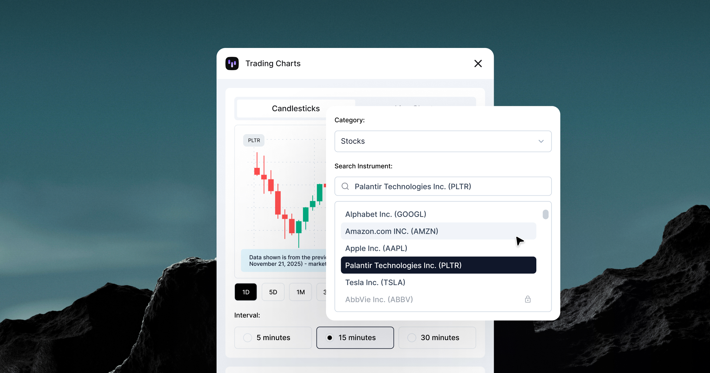
Trading Charts is live on Figma Community. It pulls live trading data - stocks, crypto, forex, commodities, ETFs - directly into Figma as editable vectors. You pick an instrument, pick a timeframe, and get an actual chart rendered from real market prices. Not a simulation of one.
Fake data is optimistic by design. It shows clean trends, smooth curves, best-case spacing - charts built around numbers that behave nicely in your layout, because you chose numbers that would.
But there's a more fundamental problem with that. When you show a client, a stakeholder, or an end user a chart where everything goes up and to the right, you're being dishonest with them. Markets don't work that way and anyone who's ever looked at a trading platform knows it. Using fake data in financial product design signals one of two things: you don't understand your audience, or you're not respecting them enough to show them the truth.
Real data does the opposite. It shows volatility because volatility is real. Tesla dropping 8% in a session, Bitcoin spiking at 3am, Gold doing nothing for two months and then moving 4% in an afternoon, gaps where markets close. Candlesticks stacking differently under pressure. That's what traders actually see, and designing around that reality is a form of respect.
There's also a compliance dimension that doesn't get talked about enough in design circles. In regulated financial products, you can't show a "happy chart" - a smooth upward curve that implies guaranteed returns. Regulators in most jurisdictions require that any performance illustration includes meaningful volatility and, where relevant, negative periods.
When you bring real market data into a design file, you also find problems you'd never catch with made-up numbers. Layouts that look perfect with smooth fake data start breaking under actual volatility - candlesticks stacking, labels colliding at extreme values, edge cases your component system wasn't built for. Real data fails in the design file, which is exactly where it should fail.
I'll be straight with you: I'm not a developer and I'm not going to pretend I deeply understood everything I was building. Four weeks of figuring things out as I went, breaking things, fixing them, breaking them again differently. The kind of process where you copy an error message into a search bar and just keep going until it stops being an error.
What I can tell you is what it does: it connects to a trading API, pulls live price data for whatever instrument you pick, and renders it directly in Figma as native vectors. Candlesticks, line charts, area fills, volume bars. You change the timeframe, you get different data. It works, it's in production, and people are paying for it.
Getting there involved more edge cases than I expected - instruments that barely trade, markets that close on weekends, price ranges so different from each other that the scaling math had to handle a $0.001 token and a Bitcoin in the same codebase without either one looking absurd on screen. That's where most of the time went.
I'm not a developer. I didn't become one. But 14 years of looking at products, knowing when something is broken, and being too stubborn to leave it that way turned out to be enough. The gap between "designer who identifies problems" and "person who ships solutions" was smaller than I'd assumed, and mostly about patience.

I expected it to feel like a milestone. It didn't. It felt like the moment you realize you now own every bug, every decision, and every support email - and there's no one else to hand any of it to.
That's clarifying in a way that designing for other people's products never quite is. When it's yours, you can't blame scope creep or prioritization or engineering capacity. It works or it doesn't. The standard is whatever you hold yourself to.
After 14 years of building inside other people's constraints, on other people's timelines, that accountability is genuinely different. Less comfortable. More interesting.

Turns out owning something fully is less about craft and more about trade-offs. Less about polish and more about whether it works well enough to be useful. That's a different kind of design problem, and one I wasn't expecting to enjoy as much as I do.
Trading Charts is free to start, with a paid tier that unlocks the full instrument catalog across all asset classes and timeframes. More data sources coming beyond Capital.com's API. If you design for finance or trading and you're still screenshotting charts - give it a try.