I Built a Figma Plugin That Uses Real Stock Market Data. Here's Why That Matters.
I spent 12 years designing products for other people. Then I built my own: a Figma plugin that pulls real trading data. Here's what changed.
November 24, 2025
I spent 12 years designing products for other people. Then I built my own: a Figma plugin that pulls real trading data. Here's what changed.
November 24, 2025
I've been a designer for twelve years. Worked on products for fintech companies, trading platforms, marketing campaigns. Made a lot of things look good. Made a lot of stakeholders happy.
But I never shipped anything that was mine. Until this week.
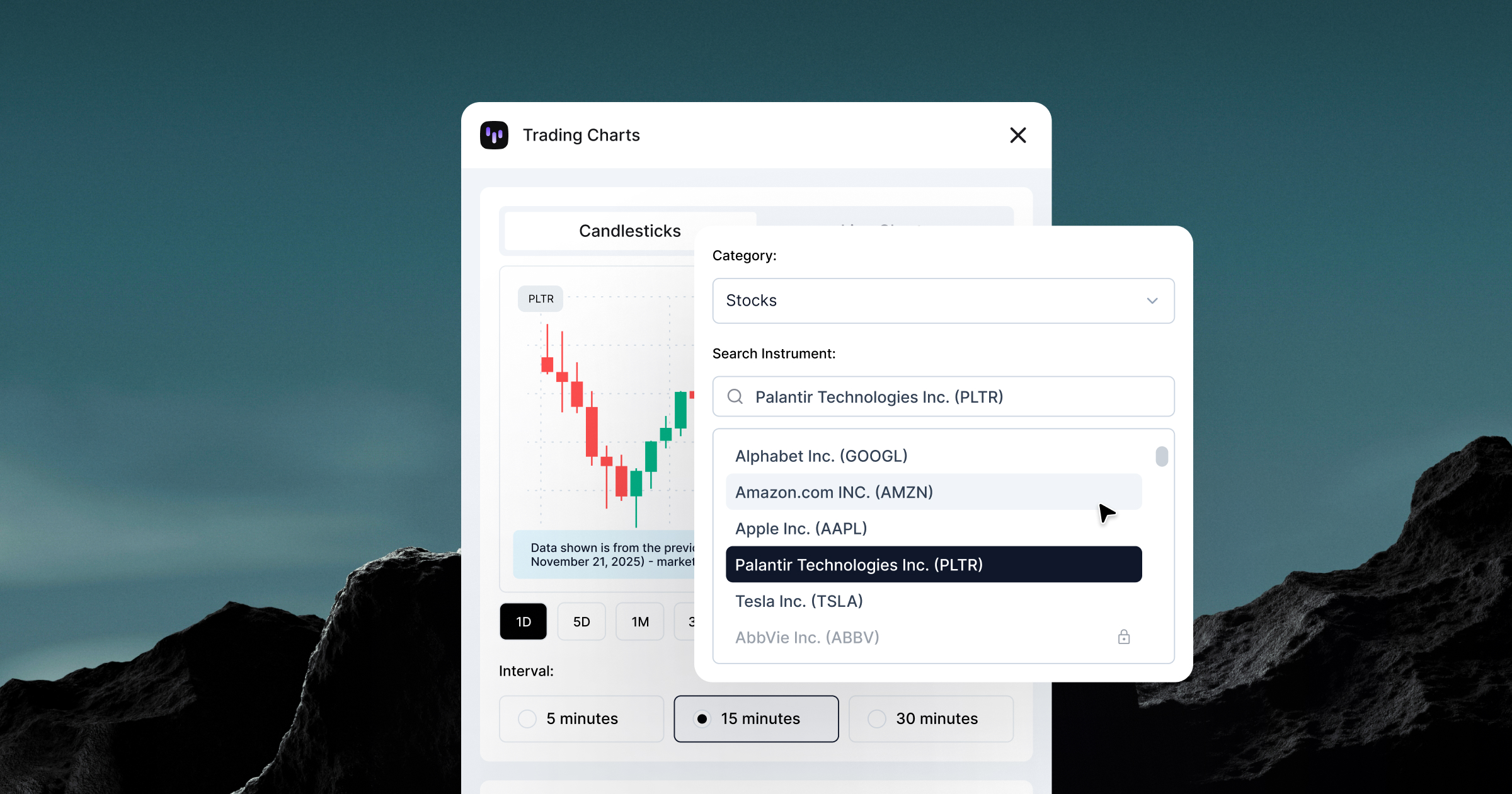
Trading Charts is live on Figma Community. It's a plugin that pulls real market data: hundreds of stocks, crypto, forex, commodities, and ETFs, directly into Figma. No screenshots or fake numbers. Actual trading data from Capital.com's API, with more sources and instruments coming.
I built it. Well, I built it with Claude handling the backend. But I architected it. I made the decisions. I dealt with the race conditions and the API rate limits and the payment integration. I shipped it.
That's a weird feeling after spending over a decade designing for other people's roadmaps.
Every fintech designer hits this wall: you need realistic charts for mockups, but your options are terrible.
Option 1: Use fake data. Make up some numbers that look plausible. Hope nobody notices that Bitcoin went from $80K to $120K in a smooth upward line with zero volatility.
Option 2: Take screenshots from actual trading platforms. Spend 20 minutes cropping and masking. Hope you don't need to update it later.
Option 3: Export data from somewhere, import it into a charting library, screenshot that, bring it into Figma. By the time you're done, the design review started ten minutes ago.
All three options suck.
I complained about this for years. "Someone should build a tool for this." You know this, ha? Classic designer move. Identify the problem, assume someone else will solve it.
Nobody did.
So a few months back, I built a version for internal use, just for our design team. It worked. People used it constantly. That's when I realized this might be worth building properly and putting out there.
Here's what's different now: I can actually fix problems myself. Not because I suddenly became a developer. But I have Claude now.
That sounds like hype. It's not. Claude is the reason Trading Charts exists. I'd spend hours searching for free API resources, testing endpoints, figuring out which ones actually worked. Claude would help me structure the code, handle the data parsing, deal with the authentication flows I didn't understand.
I did this for four weeks. Backend with Cloudflare Workers, Stripe integration for payments, license validation, API key management, error handling, etc.
The technical barriers that kept designers from building their own tools are just gone. You don't need a CS degree, you don't need to understand system architecture.
You just need to be willing to figure shit out and debug when it breaks. And it will break. A lot. Or you hit the session limit and you're just doomed until Claude Code resets.

Fake data is optimistic. It shows best-case scenarios, clean trends, perfect spacing, smooth curves that look designed, not traded.
Real market data is chaos.
Tesla dropping 8% in a day because Elon tweeted something weird, Bitcoin spiking at 3 AM on a Sunday or Gold doing absolutely nothing for two months straight.
When you design charts with real data, you find problems you'd never catch with made-up numbers.
Your chart looks perfect with smooth fake data. Then you plug in actual Bitcoin volatility and everything breaks. Candlesticks stacking on top of each other, gaps where markets close.
This is why Trading Charts matters. Fake charts look unprofessional. Traders notice. Doesn't matter if you're making an App Store screenshot or an Instagram ad. Real data shows you respect your audience enough to get the details right.
I thought shipping something would feel like a big moment. Champagne and celebration and "I made it."
Well, it didn't.
It felt like: "Oh. People are using this. Now I need to fix the bugs they're finding." Which is exactly what product teams deal with every day. Except now it's my problem, not someone else's roadmap item I'm designing around.
There's something clarifying about that. When you ship your own thing, you can't blame scope creep or engineering constraints or prioritization decisions. It either works or it doesn't. If it doesn't, you fix it.
That's a different kind of accountability than design work usually involves.
I'm not saying every designer should build plugins. Most designers don't need to, but the ones who keep complaining about missing tools? About workflow friction? About having to do things manually that should be automated?
You can fix that now. You don't need permission. You don't need a developer. You just need to actually do it.
AI didn't make designers into developers. It made designers into people who can ship solutions instead of just identifying problems. That's the shift.
For over twelve years, I designed products. I made things look good. I solved visual problems and interaction problems and occasionally convinced stakeholders that their idea wouldn't work.
But I was always designing someone else's thing. Building inside someone else's constraints. Shipping on someone else's timeline.
Trading Charts is the first thing I've built that's completely mine. The decisions, the features, the bugs, the revenue model. All mine.

And it turns out that's a different kind of design work. Less about craft, more about trade-offs. Less about polish, more about "does it work well enough to ship?"
And you know what? I like it.
Trading Charts is live on Figma Community. Free tier gives you basic access. Premium unlocks the full catalog of instruments across all asset classes and timeframes. Built it in four weeks with Claude. Learned more about product development than I did in my entire life.
Your turn.